
REASI
Type
ZLI Project
Role
Product Designer
Tools
Figma, Adobe Illustrator
Timeline
Sep to Dec 2019
OVERVIEW
Reasi is a California-based startup that digitizes land buying. Their platform streamlines the offer-to-close process by integrating money deposits and legal documents. In a word, Reasi wants to offer an easier way to buy and sell vacant land.
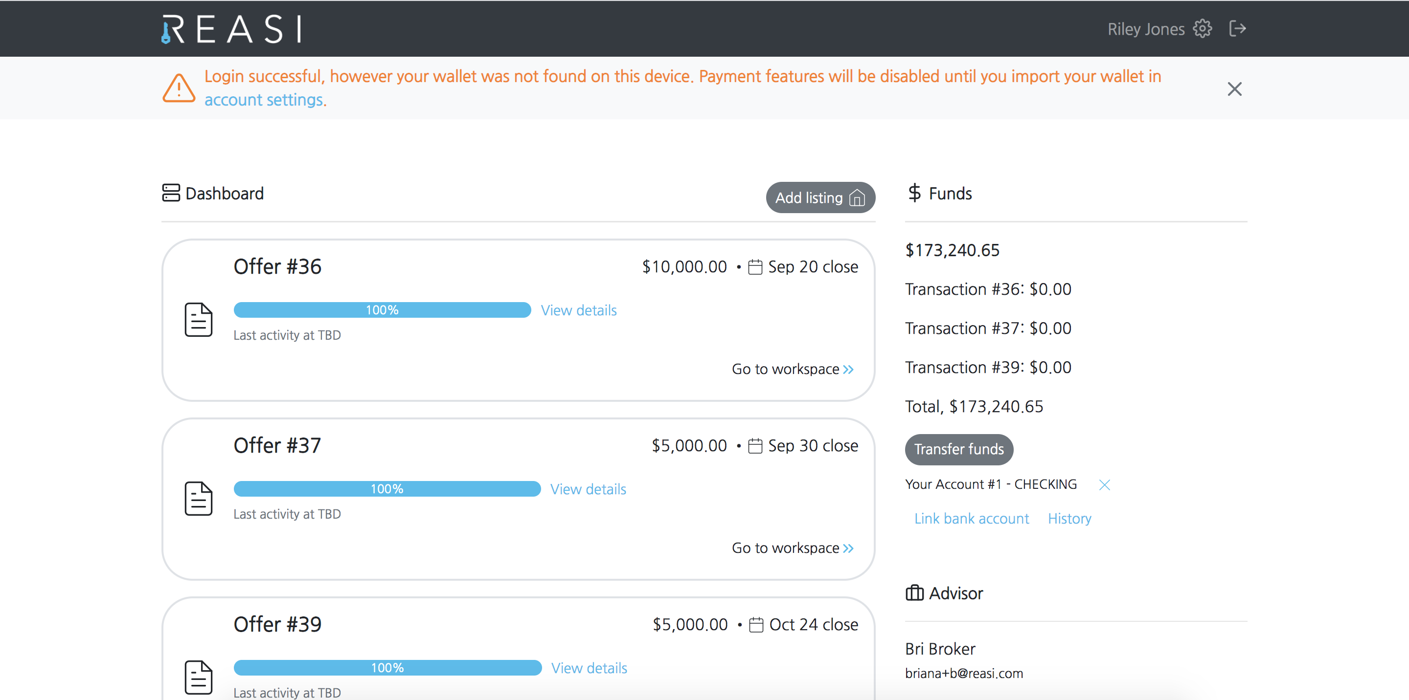
Reasi original website - Dashboard
The U.S. real estate market was totally an unfamiliar territory to me. In the kick-off meeting with our client Reasi, I was confused because I didn't know anything about the workflow, who the stakeholders are, and even the professional terms they were using. But I was also passionate and confident because I knew I can get familiar with this area quickly because I love to step into a new area, get to know target users with empathizing methods, and provide design solutions. After conducting research methods like User Interview, User Journey Map, User Workflow diagram, etc, I crafted a new mobile app design with a focus on redesigning the listing creation process and the workspace feature, which saved users about 42% time on completing transaction-related tasks and enhanced user engagement by 64%.
Initial Problem Statement
Reasi users want to have a mobile app to help them finish their tasks more efficiently.Optimize the listing creation process
Create a listing in 5 minutes with your cell phone even when you are on field trips!
Brand new progress tracking dashboard
Manage all of your listings and keep track of the transaction progress timely.

Task-centered workspace
Simplify the complicated transaction process into a few easy tasks. Reasi will take care of everthing for you!

Design Process
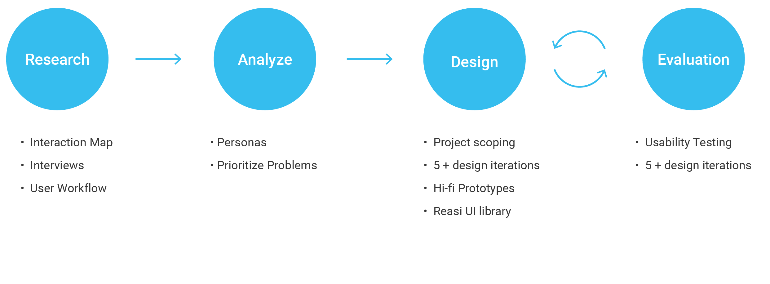
Research
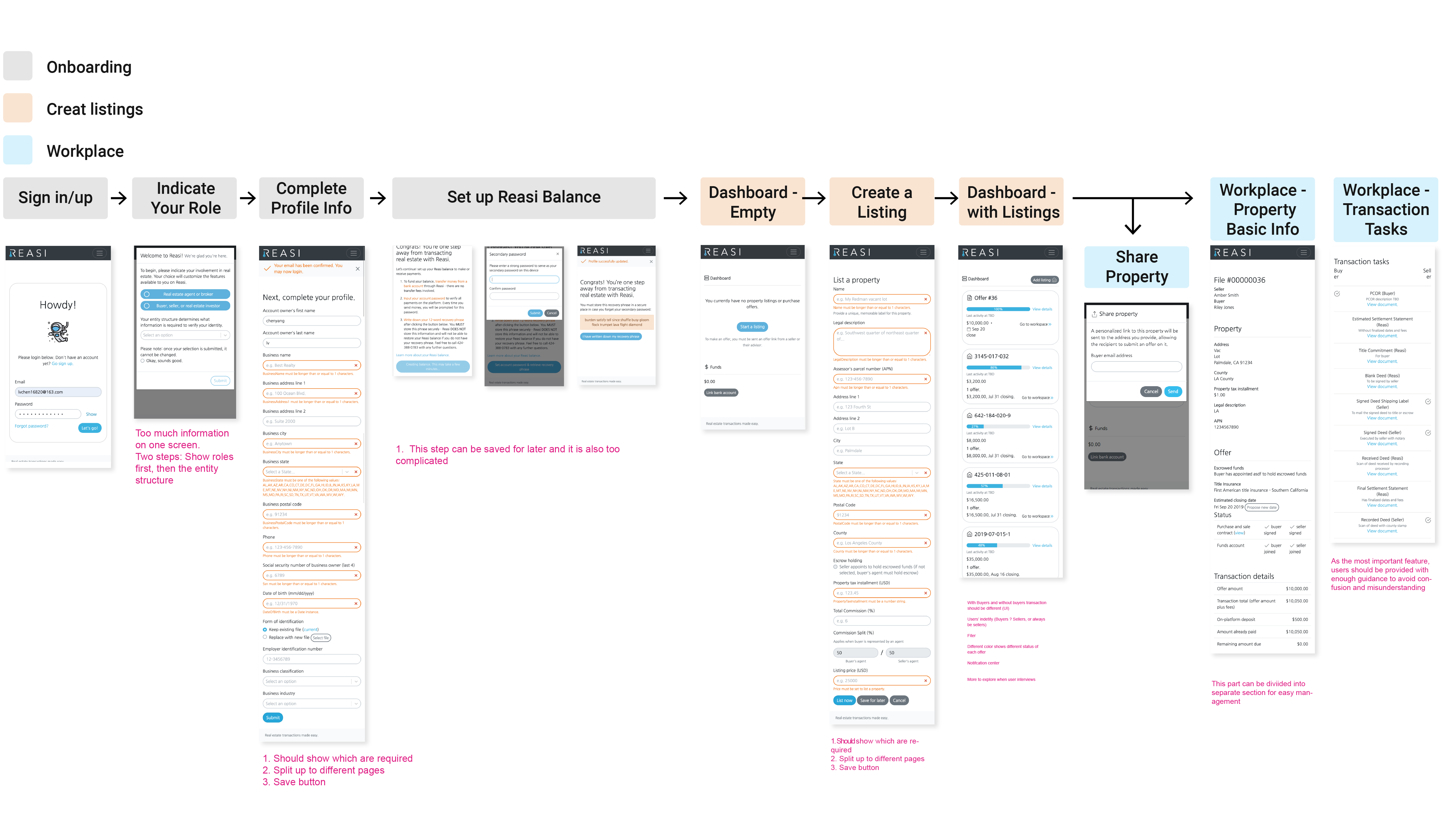
I conducted a user flow analysis of the current Reasi website by creating an interaction map, and at the same time, I also reviewed every interface and compared it against accepted usability principles by using heuristic evaluations. My goals are trying to quickly get a solid understanding of Reasi product and see where things could be improved potentially.
Key Findings: 1. The user flow can be divided into three parts: Onboarding process, Create a listing & share, and workspace. 2. The listing creation process seems overwhelming. 3. The Workspace feature requires users to complete many tasks but there is a lack of guidance. 4. Dashboard needs more indicators(colors, pictures, icons) to show different roles and status.
Also, I knew that the workspace is the most important feature of Reasi which digitizes the transaction between land buyers and sellers,
To validate my findings from the previous step and gather more insights from current Reasi users and the product owner I interviewed one Reasi employee and 4 current users.

Key Findings: 1. Reasi users are land investors who represent both sellers and buyers. 2. The dashboard should be more distinguishable in terms of showing different rols(seller, buyer), and transaction progress. 3. After opening escrow, users would only hear from the escrow company when escrow company needs them to sign documents. Normally they have to wait for more than one month and there is no status update during the process.
During interviews with stakeholders, I found myself easily get confused with the transaction process because there are too many steps and three types of stakeholders(buyer, seller, and the escrow company). To get a clear picture of the whole process and also explore potential insights in each stage, I built the user journey map to visualize the process as well as stakeholders' tasks.
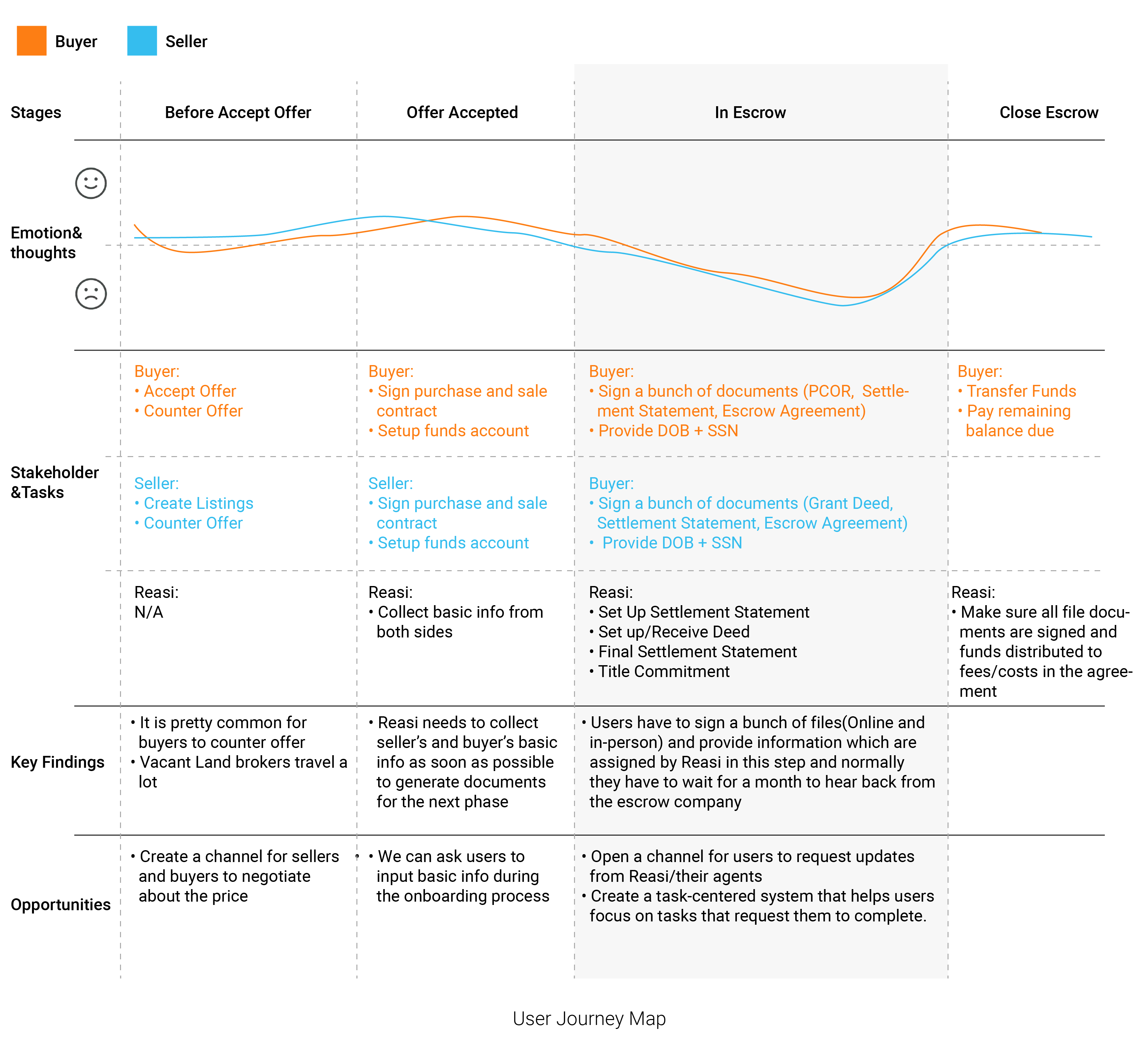
Key Findings: 1. The In Escrow stage which is also when users engage with the Workspace feature is the most challenging and frustrating stage. 2. There is a lack of a convenient way for users to communicate with the escrow company during the in escrow prcoss.
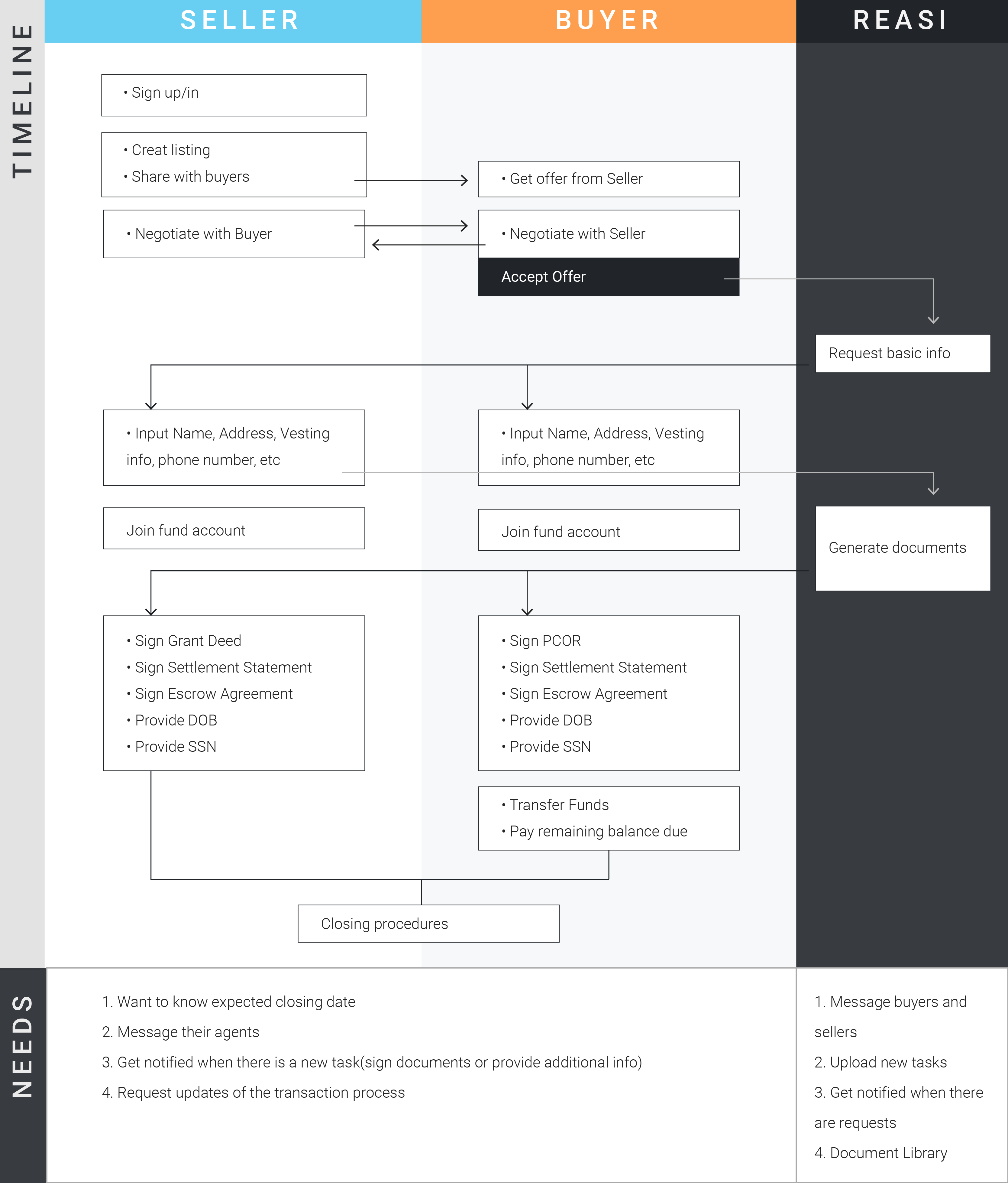
As the In Escrow process consists of multiple tasks, it is complicated and fragmented. Although I created the User Journey Map, there are still some confusions: 1. Do those tasks have to be done sequentially? 2. How do those tasks connect? 3. How do sellers, buyers, and Reasi communicate with each other in the process and or do they need to? So I decided to map all of the steps and created a workflow diagram not only take a closer look at the in escrow process but also explore how might we improve the workspace feature to help users complete tasks more efficiently.

Revised Problem Statement
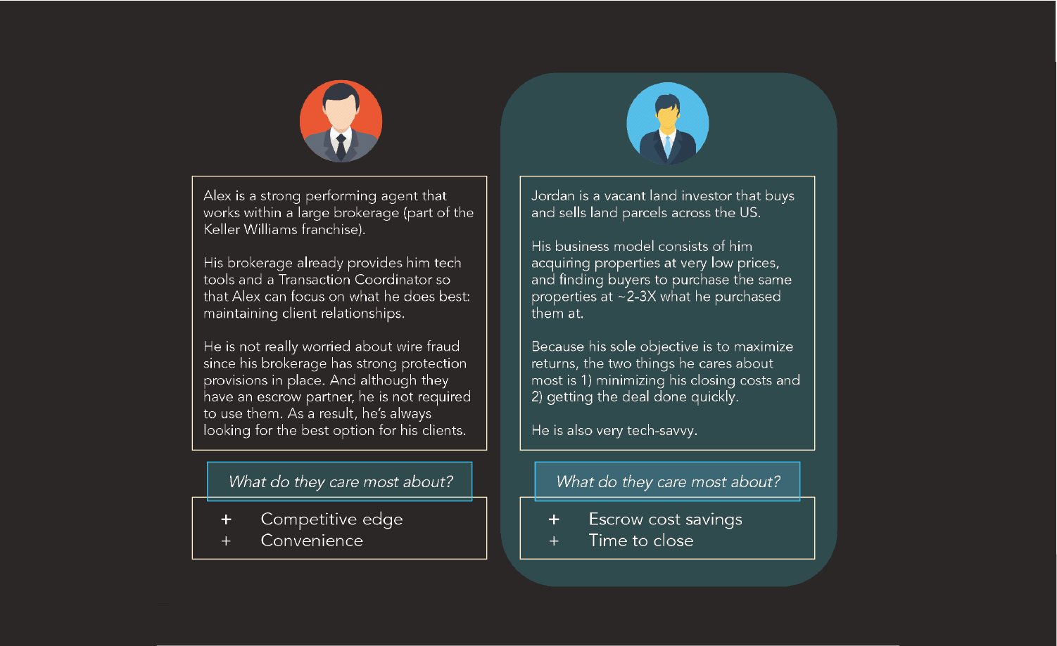
How might we create a mobile application to optimize the transaction process for land investors by providing clear guidance and simplifying their workflow?To help me keep in mind who I'm designing for, I chose Jordan the vacant land investor on the right as my primary persona.
Design Process
After previous research, I presented my findings to my ZLI manager and the product manager of Reasi. We ran a brainstorming session to come up with new solution ideas, then we used the Impact/Effort matrix to evaluate our ideas.
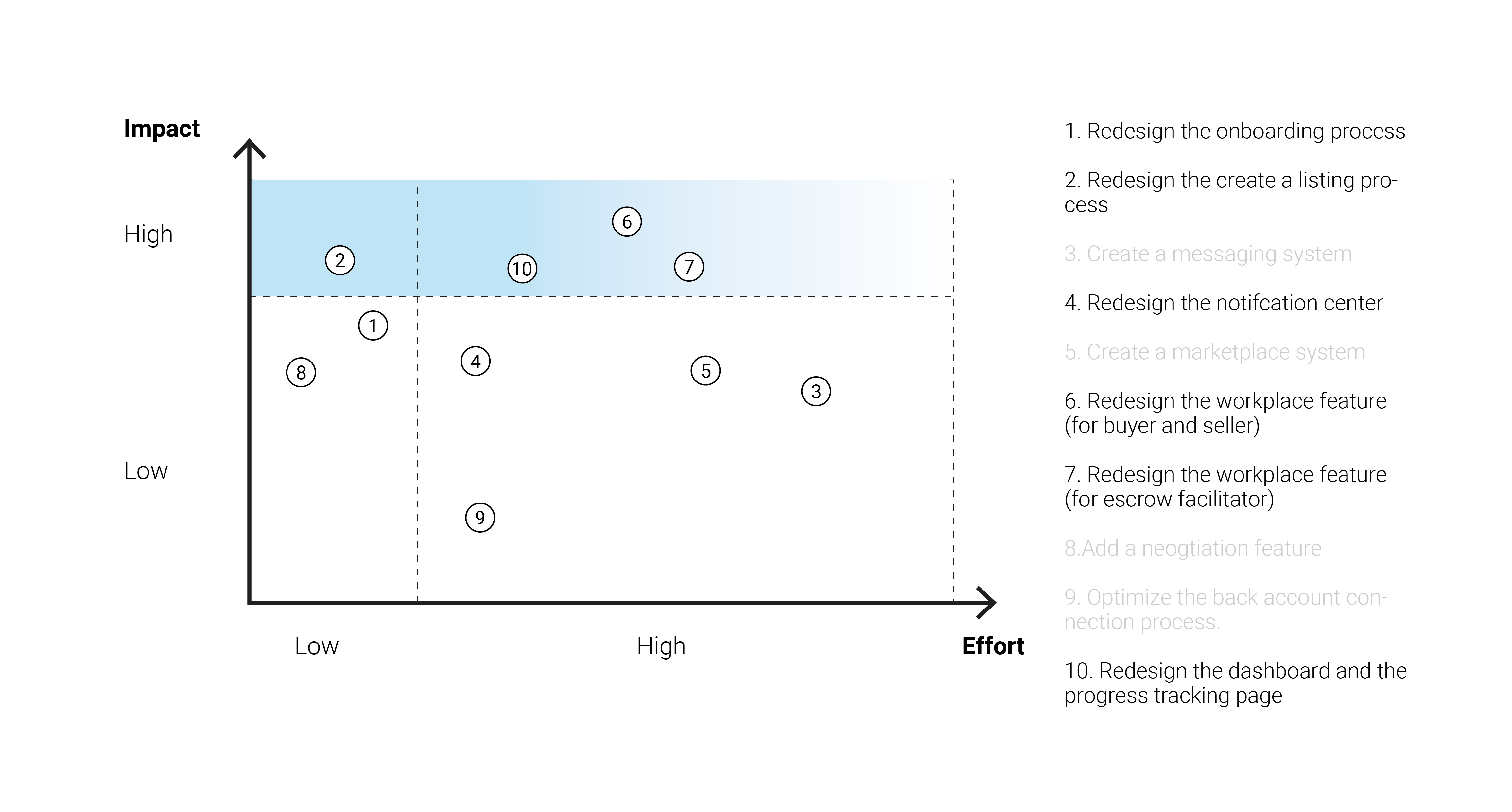
As a result, we decided to focus on 1, 2, 4, 6, 7, 10.
In the following paragraphs, I will focus on the redesign of the Dashboard and the Workspace features.
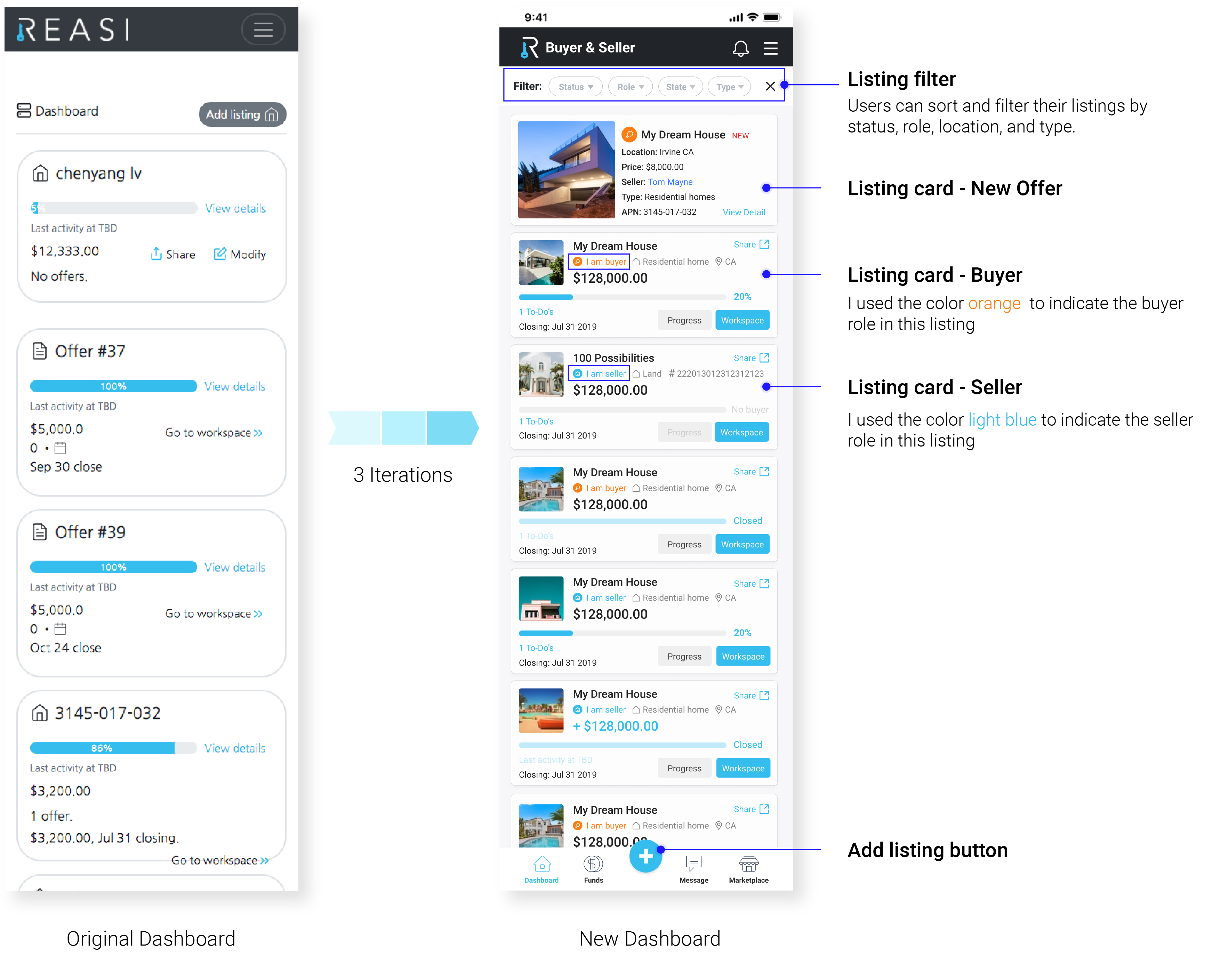
OVERVIEW The whole design process includes three iterations. I started from the original version of the dashboard. Since previous research told us that Reasi users who are land investors play both the seller and the buyer role at the same time, I kept the original design that users can check lands they are selling and buying on the same page. And I adopted many strategies here to help users distinguish each listing and manage listings effectively, which includes changing the layout of the card, adding property photos, and also using orange color to represent the role of buyer, and light blue color to represent the role of the seller. For each iteration, I presented my design to ZLI manager and Reasi product manager to get feedback and for the 2nd and 3rd round of iteration, we conducted usability testing to get feedback from users.
Listing Card Redesign

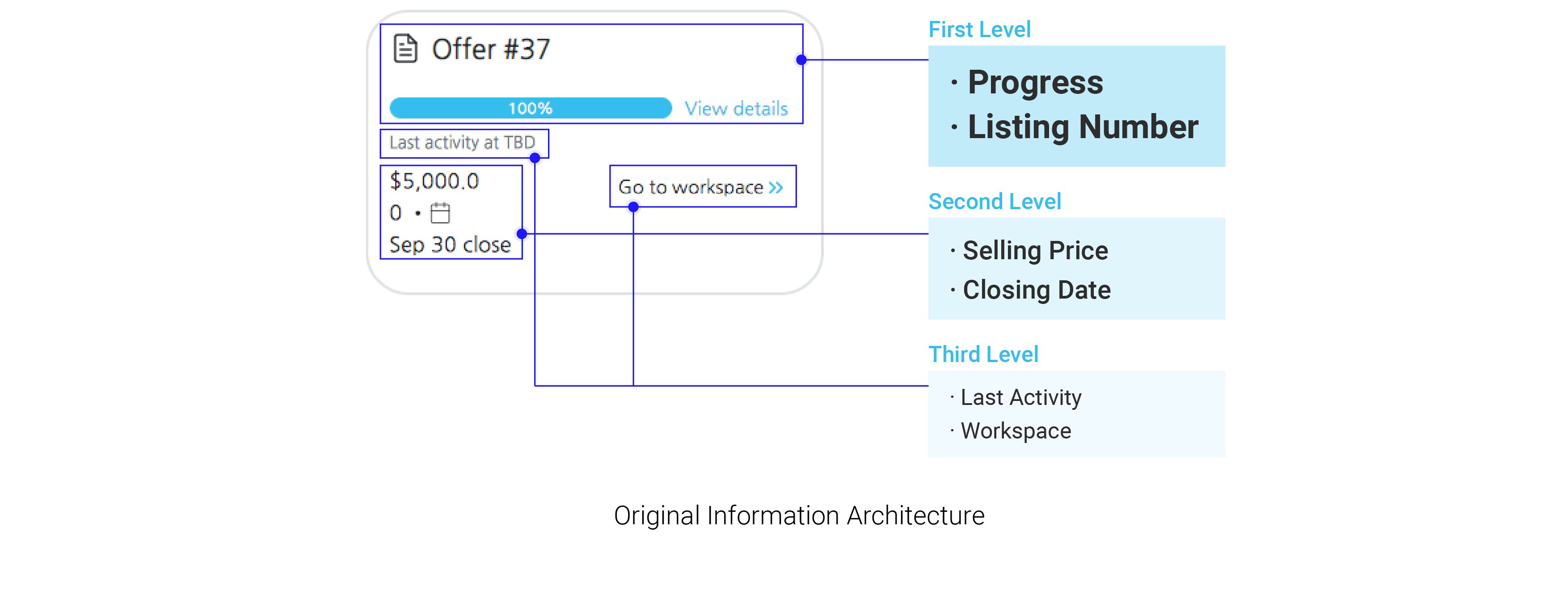
ITERATION 1: To start with, I took a look at the information architecture of the card and see if the hierarchy that the card is surfacing to users is what they need to see the most. And also I wanted to know if the listing card is providing enough or digestible amount of information to the user.
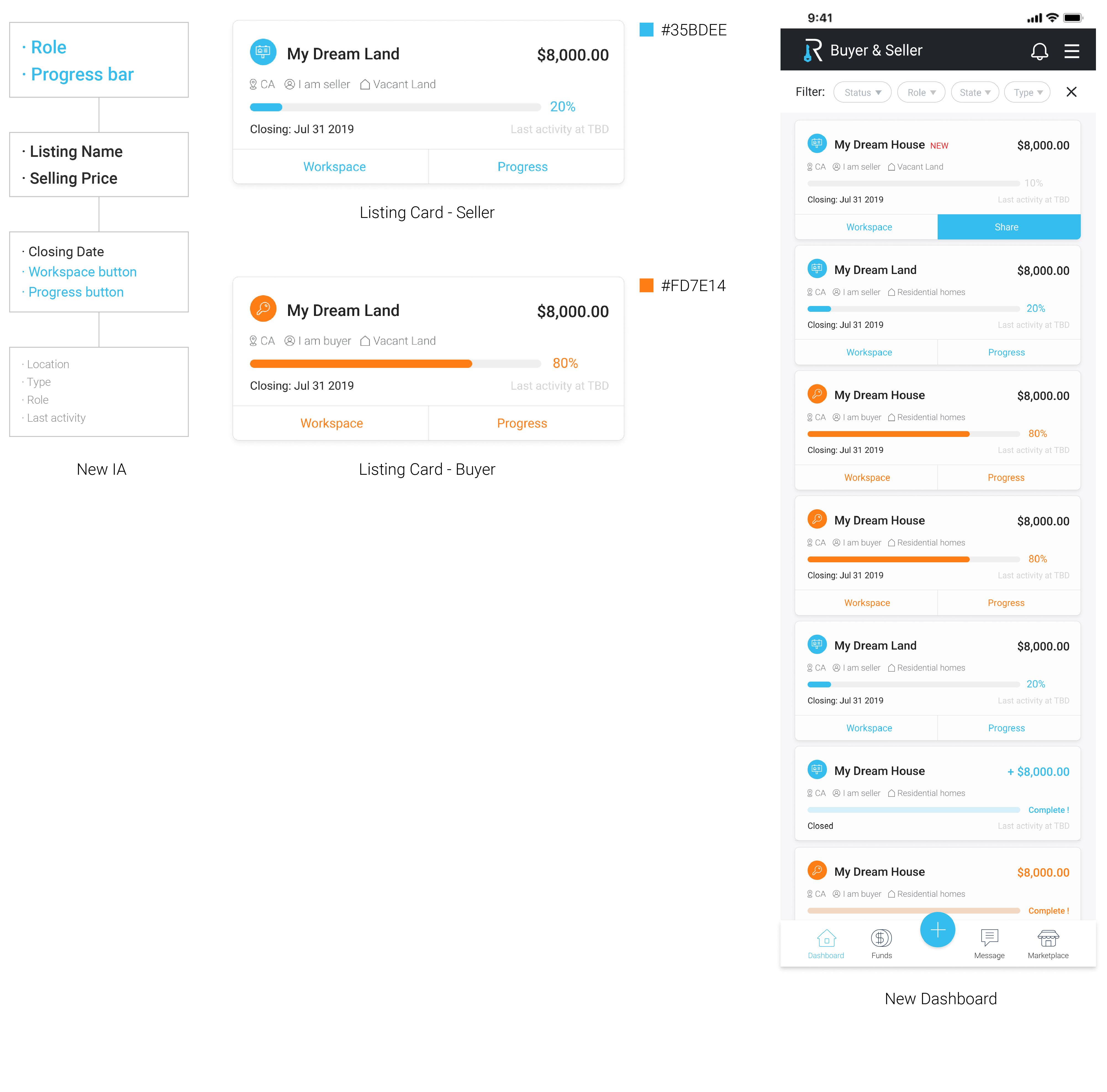
Based on insights from previous interviews with users and Reasi product manager, I created a new card layout. First of all, I redesigned the information architecture of the card, according to users, the first thing they want to know when they visit dashboard is which are lands they are selling and which are they are buying, then they want to know what's the listing progress. I have decided to use two different colors to represent the role of buyer and seller.
FEEDBACK: - It would be more distinguishable if users can add photos of the lands since images are much easier to remember. - The differences between each IA levels are not significant.
ITERATION 2: Before moving onto the next iteration, we showed our design to 3 target users and received positive feedback on the new layout. In the meantime, our users also suggested us to emphasize a little bit more on the selling price since, in the transaction, the price might vary from time to time. It would be helpful if they can check the latest price when they open the app. So I made several changes in this round: 1. Users can upload photos when creating listings. 2. Put more emphasis on the selling price which should be as important as the listing name in terms of information architecture.
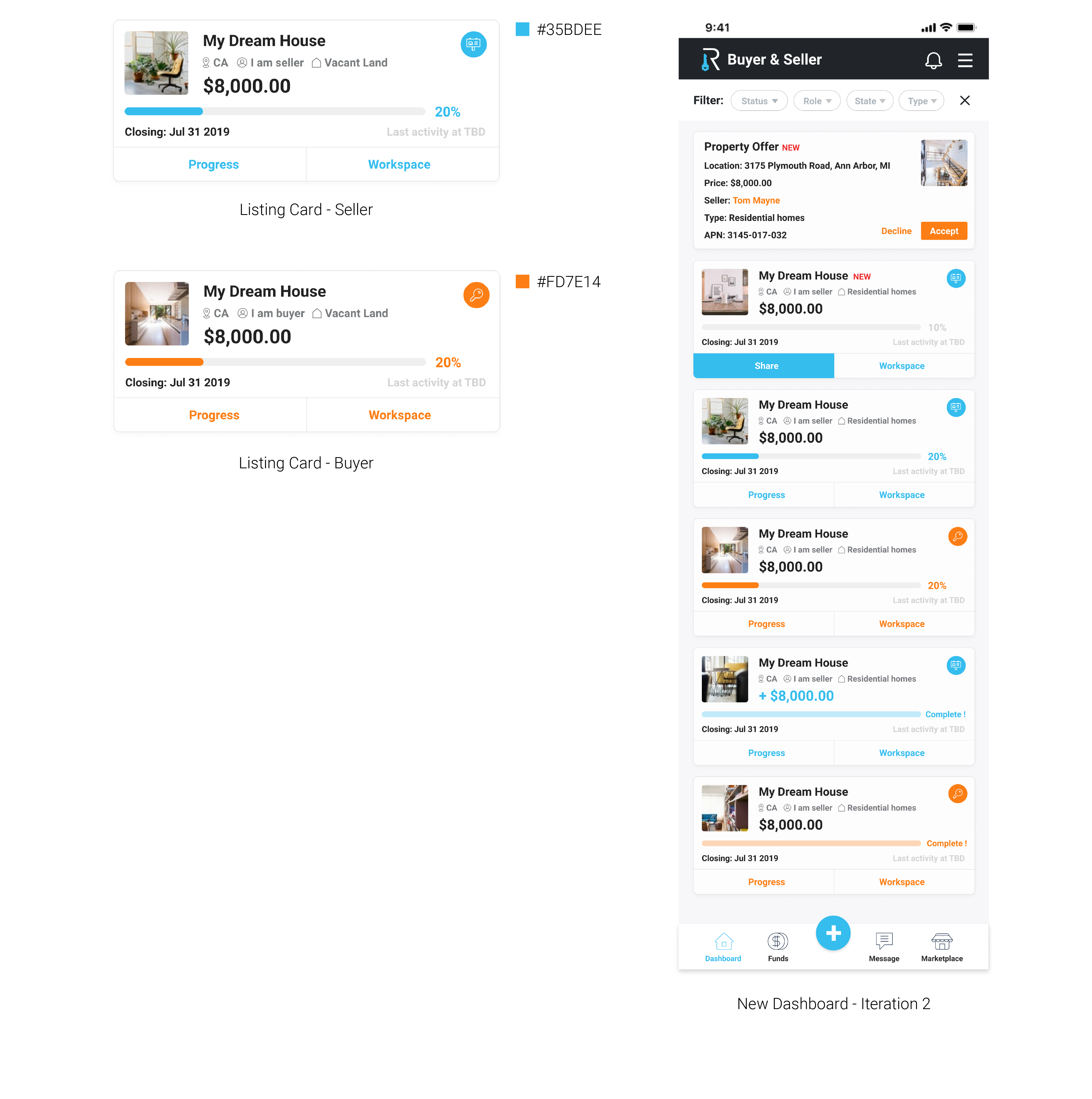
FEEDBACK: - There are many elements on the listing card that help users distinguish between different listings, so it is more important now to keep the color consistent across different cards and keep the minimal difference to guide new users. - Try to reduce the size of those two buttons for users to access more easily when they are on the field trip.
ITERATION 3: I presented my design to my managers and we ran a second round of testings with our users. Here are my findings: 1. Users still need the "Share" function even they already have a buyer for a property. 2. Move the two buttons to right/left would be easier for them to tap those two buttons. 2. Users want to know what tasks they need to complete on the dashboard Based on the insights, I created the final listing card design:
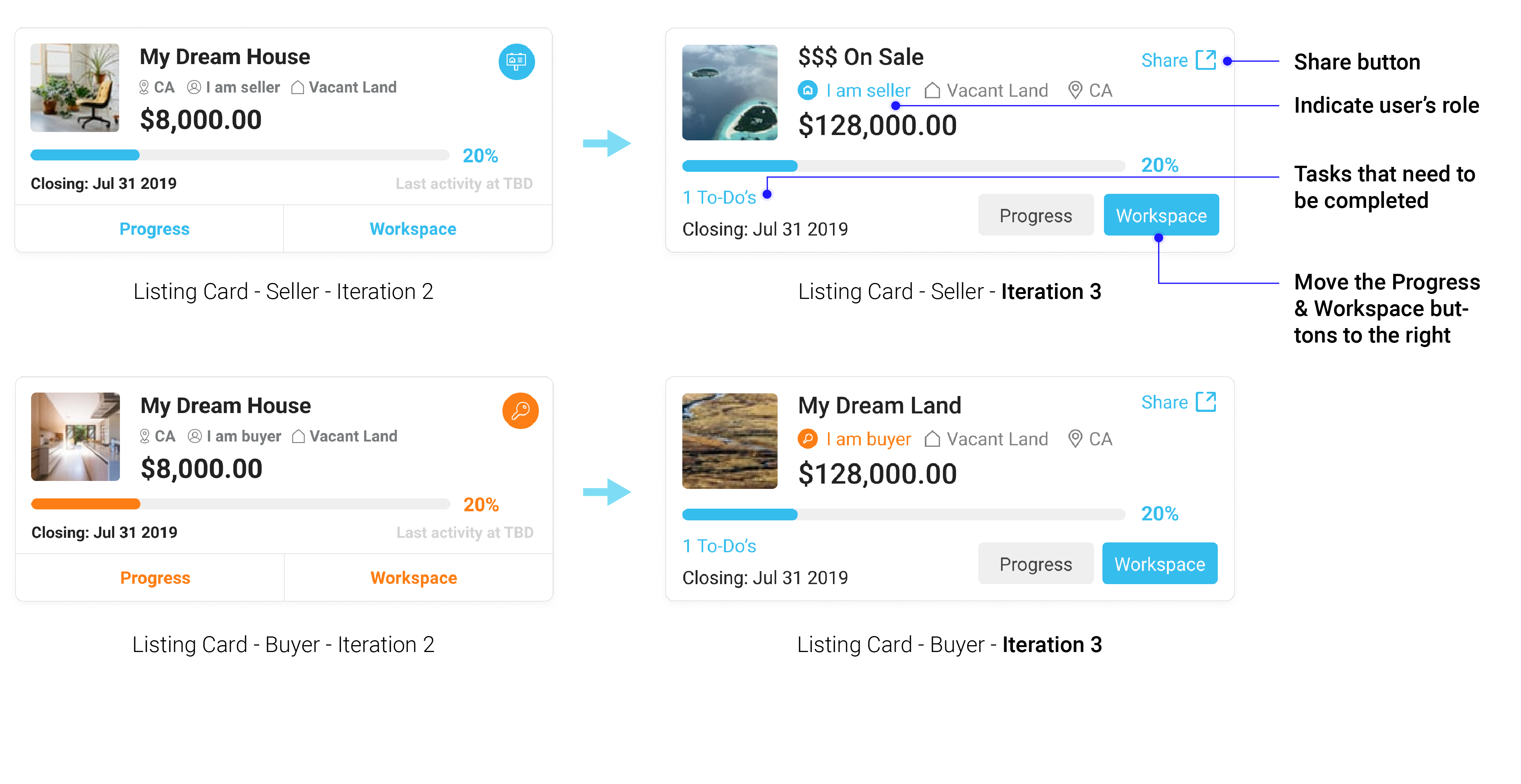
FEEDBACK: - Users can manage different transactions more effectively. - The UI looks more consistent.
OVERVIEW The workspace feature is for sellers and buyers to complete all required closing tasks after buyers accept the offer and they open escrow. The original workspace feature showed every piece of information on the same page which ends up being super long. Based on previous research and 3 iterations, I turned it into a task-centered system that prioritizes tasks that are waiting for actions and also added a new feature for users to communicate with the Reasi facilitator efficiently and simply.
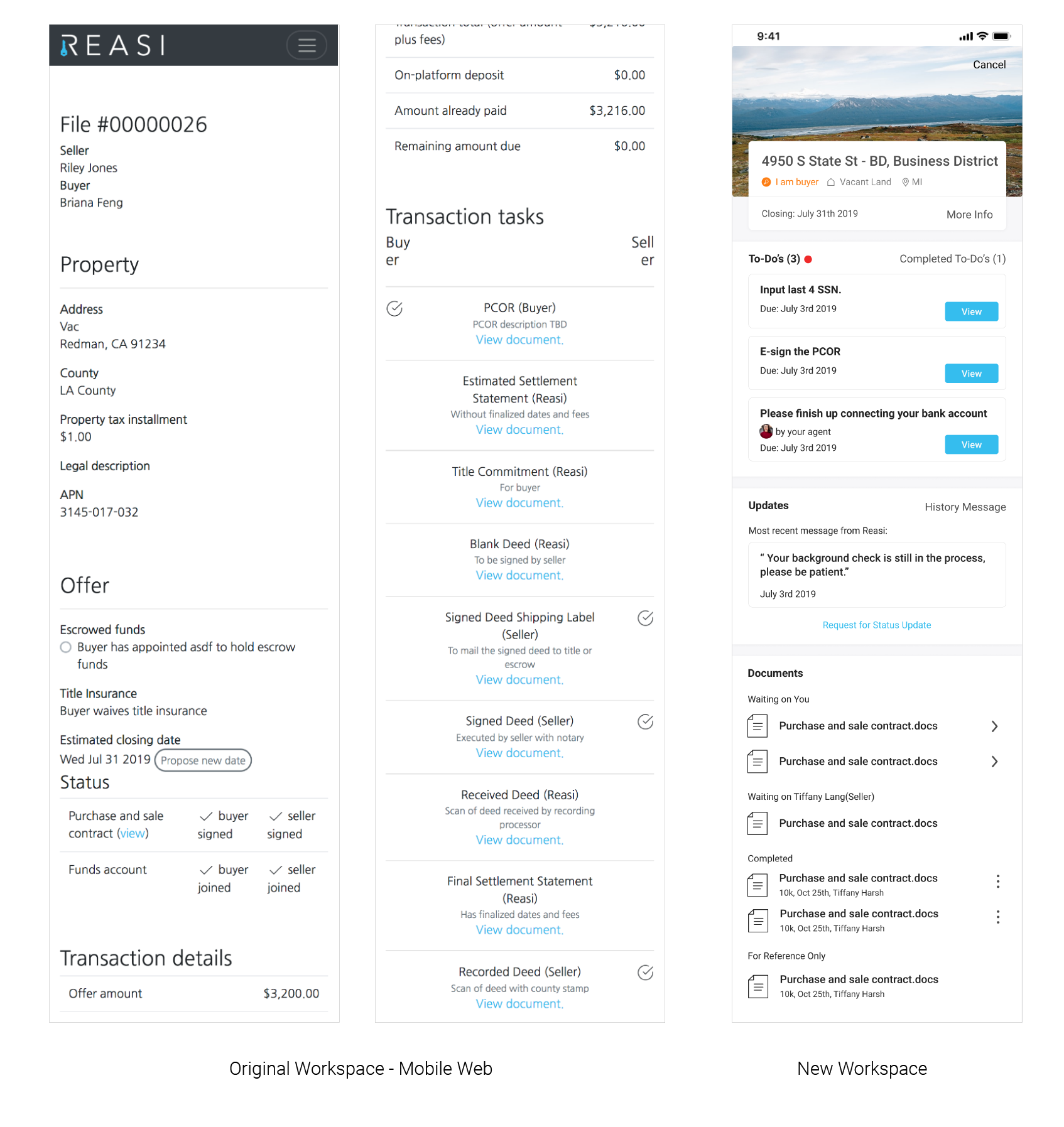
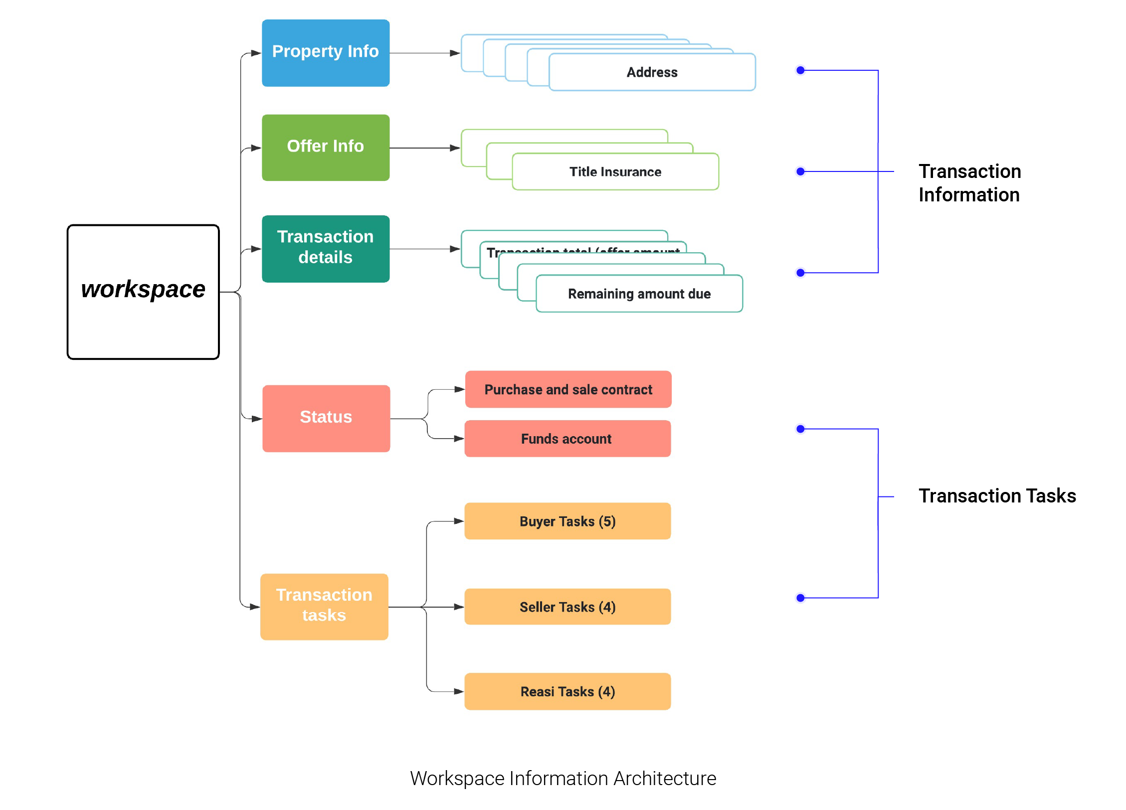
ITERATION 1: The original workspace mainly consists of five sections. To get a better understanding of the current solution, I visualized the information architecture by drawing this diagram below, then I figured out the five sections can be integrated and simplified into two parts: 1.Transaction Information 2.Transaction Tasks.
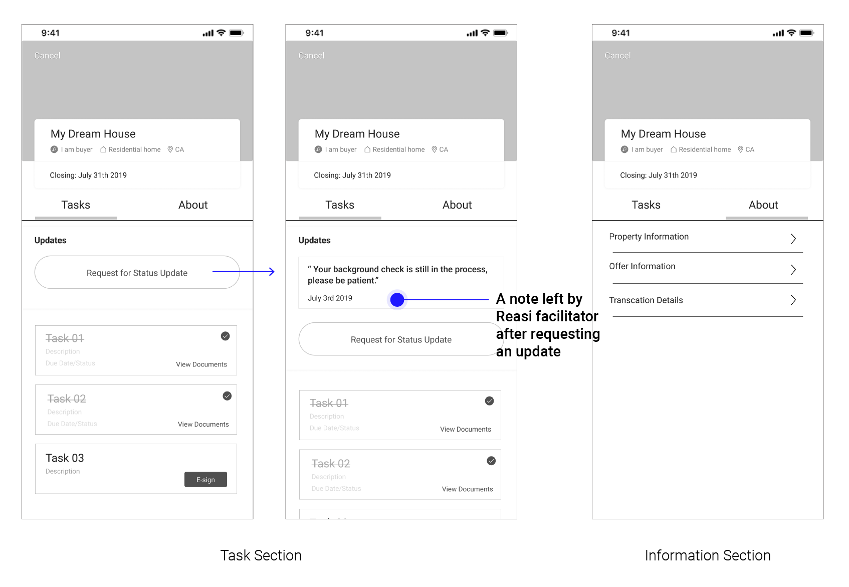
So I decided to split the Workspace feature up into two sections: the task section and the information section. In the meantime, based on the insights from previous research, I turned the task section into a task list with a progress bar to help users be aware of tasks in the future. I also added the Message feature for users to request transaction status updates. To begin with, I used sketches to present my idea to ZLI and Reasi manager to get feedback quickly.
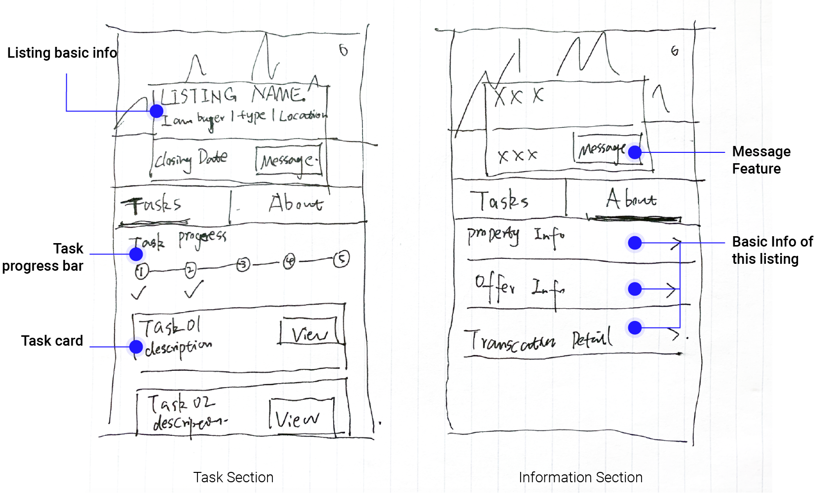
FEEDBACK: - It would require too much effort to develop a whole new messaging section just for users requesting updates, and also Reasi was hoping to automate the escrow process in the future so a messaging system would increase the operating costs. - Getting rid of the task progress bar because it is repetitive and unnecessary since it is shown on the dashboard.
ITERATION 2: For this round of iteration, I got rid of the messaging feature and the task progress bar based on previous feedback. Instead, I created a new model for users to request for updates: users can let the Reasi facilitator know that they want an update by clicking the "Request for Update " button, and then the Reasi facilitator would receive this request and respond to it by leaving a note to users.
USABILITY TESTING
To get feedback from real users on the new feature and the new layout, I conducted usability testings
with 3 real Reasi users.
FEEDBACK: - I noticed that users rarely access the About section to check the basic information of the listing. They mentioned that normally the basic information would be confirmed before they enter the escrow process and they wouldn't refer to it frequently. - The Task section should emphasize unfinished tasks instead of putting completed tasks above unfinished tasks. - The "Request for Update" feature is intuitive and simple, and also offers users an option to communicate with Reasi without spending too much effort.
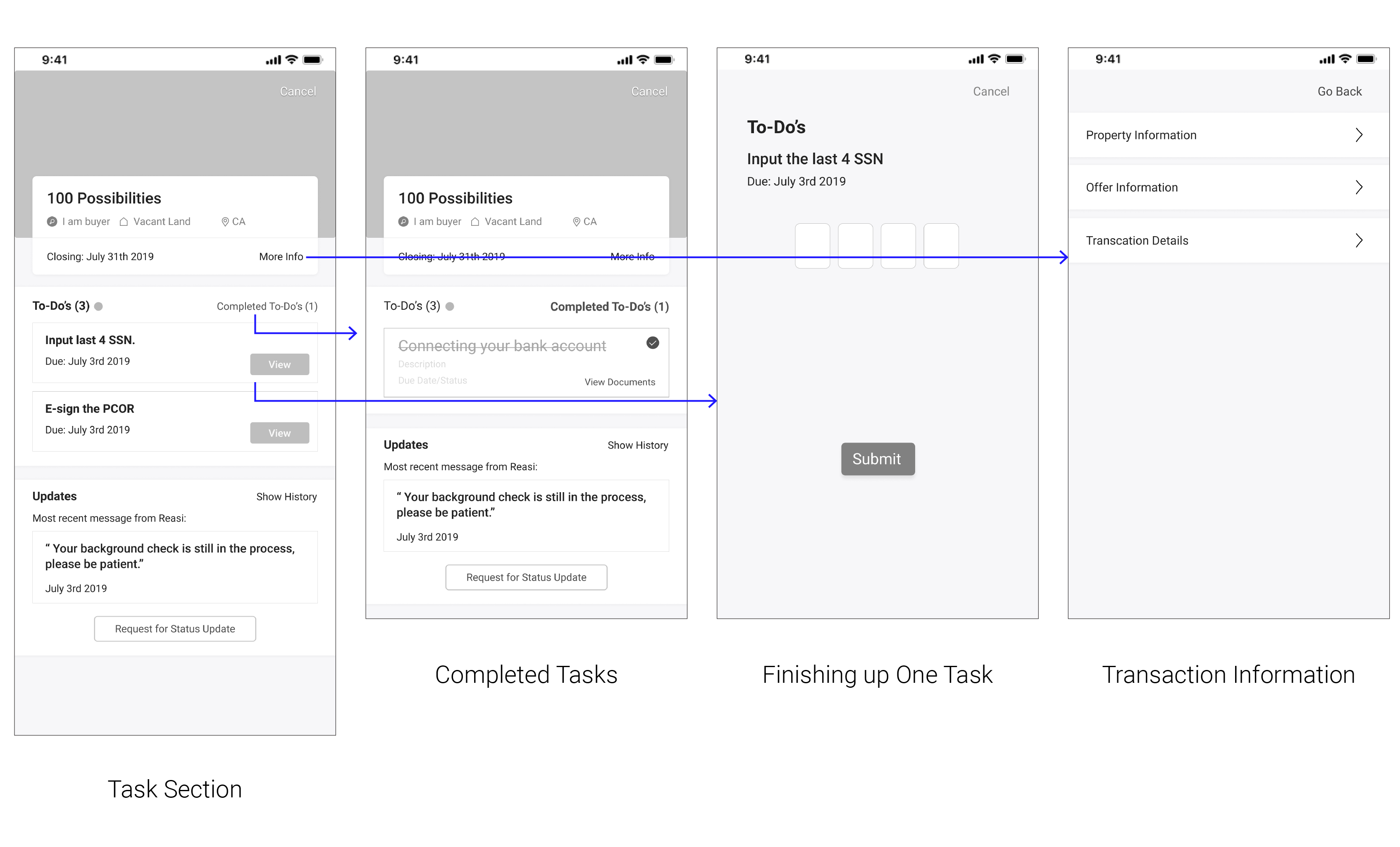
ITERATION 3: Based on insights from previous testing, I moved the whole information section onto another page which users can access by clicking the text "More Info" on the original page, which not only made the first page look simple and emphasize on the tasks, but also helped users store those information in case they need to see it. Also, I split the Task section up into two parts: To-do's and Completed tasks to help users emphasize on tasks that they need to do.
USABILITY TESTING
After this round of iteration, I presesnted my design to the product manager and the dev team of Reasi to get their insights.
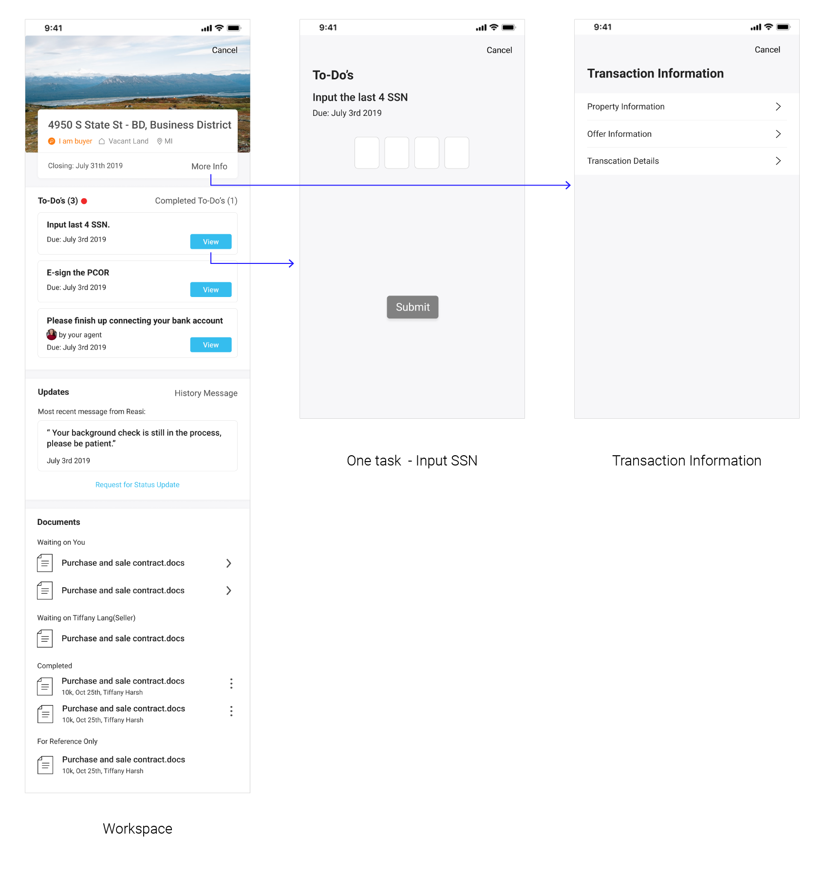
FEEDBACK: - It would be helpful if it can have a documentation section to help users easily find those files and users would be able to get informed when Reasi facilitators upload new files.
Workspace Final Design
Final Design
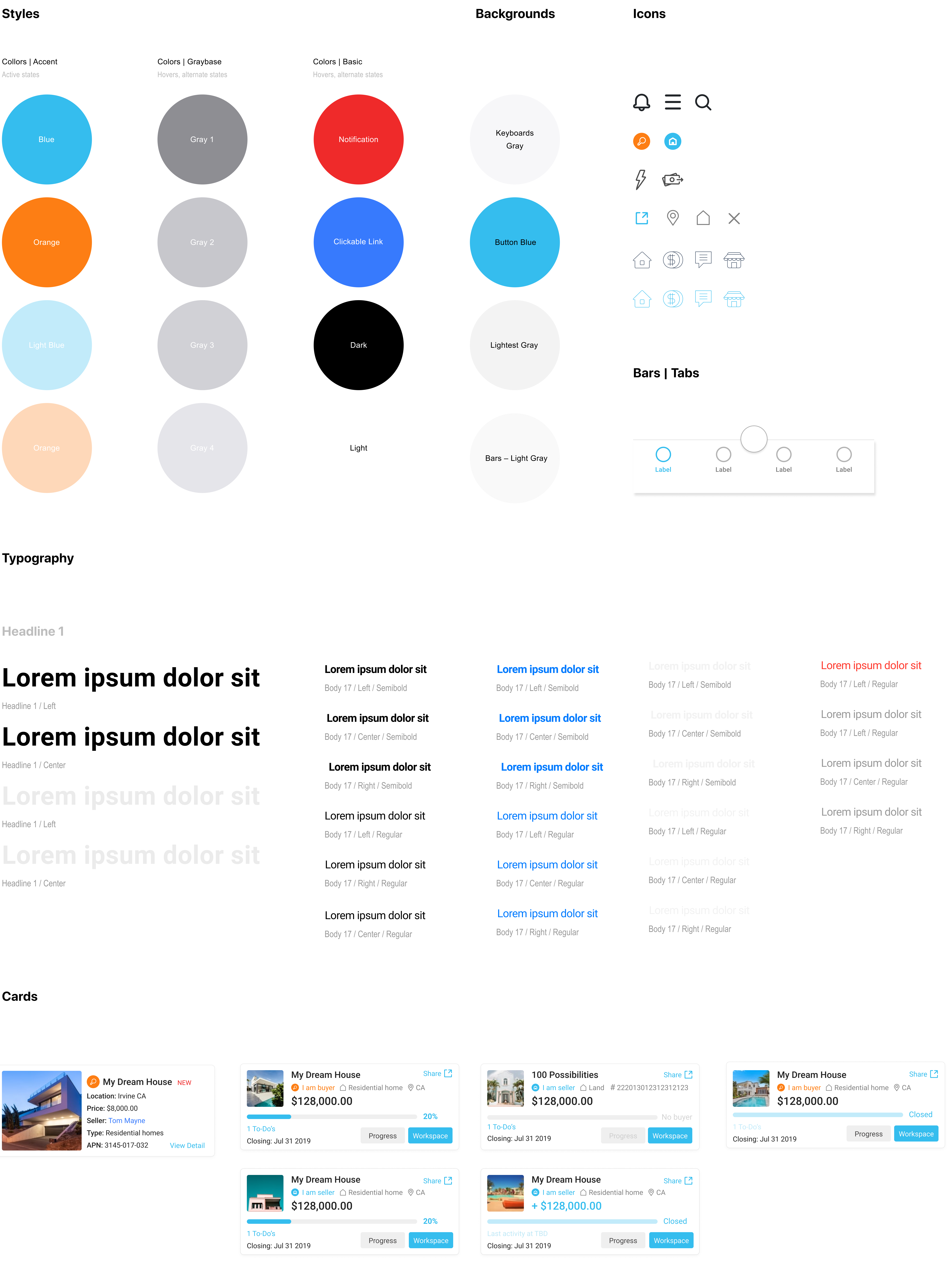
Visual Design
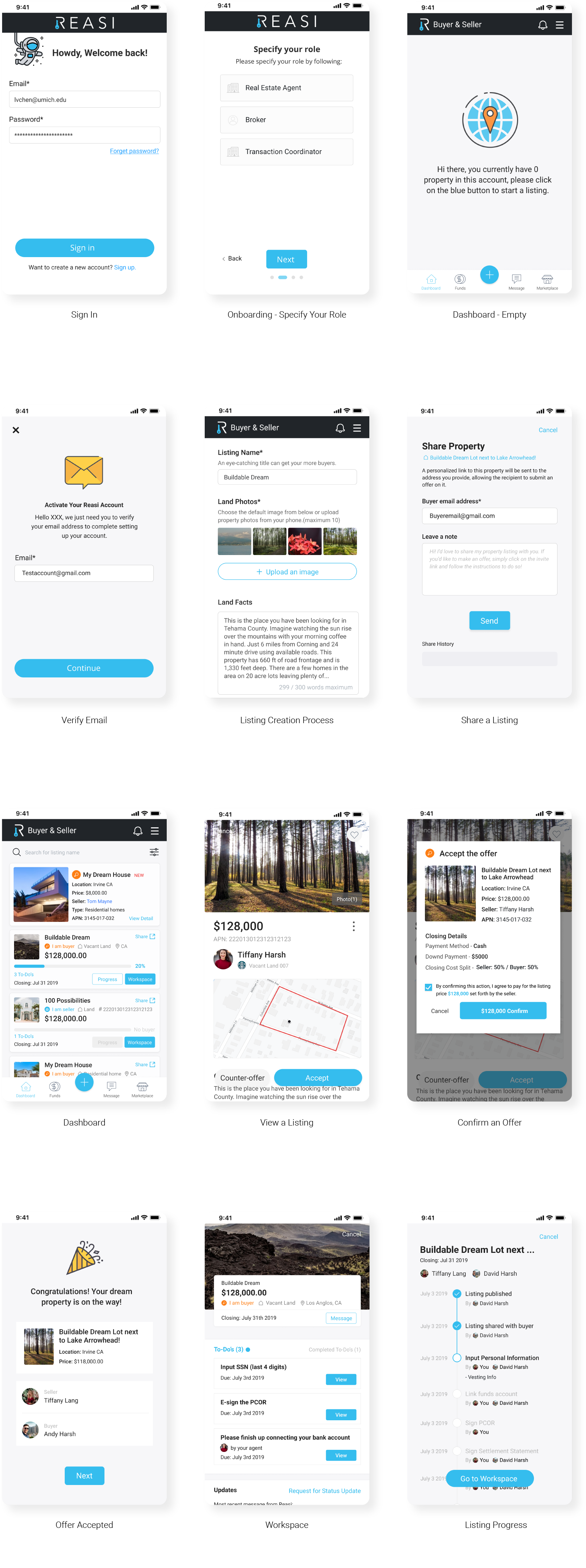
Hi-fi Prototypes
Reflection
It is intimidating to step into a whole new world like the real estate industry and try to fix problems for experts in that area. I did spend a fair amount of time on understanding how does the real estate transaction work in the U.S., who are the stakeholders, and even real estate terms. But those efforts paid off when I started to work on the design part. I can put myself in users' shoes and be confident about my ideas because I know every single step in the whole complicated progress and when I took a closer look at each of them, the perplexing process will be broken down into multiple smaller pieces and the problem is easier to solve.